How to Prepare Print-Ready Artwork for Banners and Signs
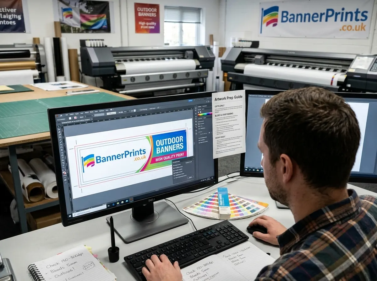
Submitting correct artwork is the single most important step in getting a great printed banner, sign, or sticker. Incorrect files cause delays, reprints, and disappointing results. The good news is that preparing print-ready artwork is straightforward once you understand the key requirements.
This guide covers everything you need to know to prepare your artwork correctly, whether you are a professional graphic designer, a small business owner using Canva, or someone creating a banner design for the first time.
What Does Print-Ready Mean?
Print-ready artwork is a file that can go straight to the printer without any modifications. It has the correct dimensions, resolution, colour mode, bleed, and file format. When you supply print-ready artwork, you eliminate the need for the printer to make adjustments, which speeds up production and ensures the final product matches your design exactly.
File Format
The file format you use affects the quality and editability of your artwork:
- PDF (Recommended) – PDF is the gold standard for print-ready artwork. Save as a press-quality PDF with all fonts embedded or converted to outlines. This ensures the file prints exactly as you designed it, regardless of what software the printer uses.
- AI (Adobe Illustrator) – Native Illustrator files are excellent for vector-based designs. Convert all text to outlines before saving to avoid font substitution issues.
- EPS (Encapsulated PostScript) – A reliable format for vector artwork, widely compatible with professional print software.
- TIFF (Tagged Image File Format) – Best for photographic or raster-based artwork. Save at full resolution without compression.
- High-resolution JPEG or PNG – Acceptable for simple designs, but JPEG compression can introduce artefacts, and PNG files can be very large at print resolutions. Use these as a last resort if you cannot supply PDF, AI, or TIFF.
Avoid submitting Word documents, PowerPoint files, or low-resolution images downloaded from websites. These formats are not suitable for professional print production.
Resolution: DPI Explained
DPI stands for dots per inch and determines how sharp your printed image will be. The required DPI depends on the viewing distance:
- 300 DPI is the standard for close-viewing applications like business cards, brochures, and small signs.
- 150 DPI is suitable for banners and signs viewed from 1 to 3 metres.
- 100 DPI is acceptable for large-format banners and building wraps viewed from 5 metres or more.
- 72 DPI is screen resolution and is NOT suitable for any print application.
The key principle is: the further away the viewer, the lower the DPI can be without loss of quality. A billboard viewed from 50 metres can be printed at 30 to 50 DPI and still look sharp, while a roller banner viewed from 1 metre needs at least 150 DPI.
Always design at the final print size. If your banner is 4ft x 8ft, set your document to 4ft x 8ft at 150 DPI. If you design at a smaller scale (for example, half size), you need to double the DPI to compensate.
Colour Mode: CMYK vs RGB
This is one of the most common sources of colour disappointment in printed banners.
- RGB (Red, Green, Blue) is the colour mode used by screens, monitors, cameras, and digital displays. Colours in RGB are created by mixing light.
- CMYK (Cyan, Magenta, Yellow, Key/Black) is the colour mode used by printers. Colours in CMYK are created by mixing ink on paper or vinyl.
The problem is that RGB can produce a wider range of colours than CMYK. Bright neons, vivid blues, and intense greens that look stunning on screen often cannot be reproduced exactly in print. When an RGB file is printed, the printer’s software automatically converts it to CMYK, and some colours will shift, usually becoming slightly duller.
To avoid surprises, design in CMYK from the start. This way, the colours you see in your design software are a closer representation of what will actually print. If you are using Canva or a similar online tool that only works in RGB, be aware that bright, saturated colours may look slightly different in print.
Bleed and Safe Zone
Bleed and safe zones are essential for a professional-looking final product.
What Is Bleed?
Bleed is the extra area of artwork that extends beyond the final trim edge of your banner or sign. It exists so that when the material is trimmed to size, there is no risk of a thin white strip appearing along the edge if the cut is slightly off.
- Standard bleed for banners: 3mm to 5mm on all sides.
- For roller banners: add 150mm extra at the bottom of the design for the portion that tucks into the cassette.
What Is the Safe Zone?
The safe zone is the area inside the trim edge where all important content (text, logos, key graphics) should be placed. Anything outside the safe zone risks being trimmed off or obscured by fixings.
- Standard safe zone: keep all important content at least 5mm to 10mm inside the trim edge.
- For banners with eyelets: keep important content at least 20mm from any edge where eyelets will be placed, as the eyelet punches through the material.
Font Handling
Font issues are one of the most common causes of artwork problems:
- Convert all text to outlines (also called curves or paths) before saving your file. This converts the text from editable characters into vector shapes, eliminating the risk of font substitution.
- If you cannot convert to outlines, embed the fonts in your PDF. This includes the font data in the file so the printer’s software can render the text correctly.
- Avoid using system fonts like Arial or Times New Roman for design-critical elements, as different versions of these fonts can render slightly differently across systems.
- Minimum font size for banners: 12pt for disclaimers and fine print, 24pt for body text, and as large as possible for headlines. The appropriate size depends on the viewing distance.
Image Quality
If your design includes photographs or raster images, these need to meet the resolution requirements:
- Do not download images from websites for print use. Web images are typically 72 DPI and will print blurry.
- Do not enlarge small images to fill a large space. Stretching a 500px image to fill a 4ft banner will result in severe pixelation.
- Use original high-resolution source files from your camera, stock photo library, or designer.
- If you are using stock images, download the highest resolution version available, usually the print or extra-large option.
Common Artwork Mistakes
These are the errors we see most frequently at BannerPrints:
- Supplying RGB files instead of CMYK, resulting in colour shifts.
- Low-resolution images that look fine on screen but print blurry.
- Text not converted to outlines, causing font substitution.
- No bleed, resulting in white edges on the finished product.
- Important content too close to the edge, getting trimmed or covered by eyelets.
- Using transparency effects that do not flatten correctly in the exported file.
- Including crop marks and registration marks inside the artwork area.
- Submitting the wrong dimensions, for example designing in inches when the order is in millimetres.
Artwork Checklist
- File format: PDF, AI, EPS, or TIFF
- Resolution: 150 DPI minimum at final print size
- Colour mode: CMYK
- Bleed: 3- 5 mm on all sides (150mm bottom for roller banners)
- Safe zone: important content 5- 10 mm inside the trim edge
- Fonts: converted to outlines or embedded
- Images: high resolution, not stretched or upscaled
- Dimensions: match the ordered size exactly