How to Design a Roller Banner That Works
A roller banner has about three seconds to do its job. Someone walks past your stand, glances over, and either stops or keeps moving. That decision is made before they read a single full sentence, which means the design has to work instantly, or it does not work at all.
Most roller banners fail this test. They are crammed with text, the logo is lost at the bottom, the key message sits where a table hides it, and the whole thing reads like a leaflet blown up to two metres tall. It is not a printing problem. It is a design problem, and it is entirely avoidable.
This guide walks through how to design a roller banner that actually gets noticed and remembered, from the top-third rule to text sizes, safe margins and artwork setup.
How Do You Design a Good Roller Banner?
Design a roller banner in three zones: your logo at the top where it is always visible, your single main message in the middle at eye level, and your call to action near the bottom but above knee height. Keep to one clear message, use large text that reads from three metres away, leave a safe margin at the top and bottom, and supply artwork at the correct size in CMYK. One idea, big and bold, beats a wall of text every time.
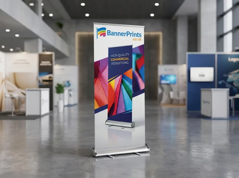
The single biggest mistake in roller banner design is treating it like a printed page. A page is read up close, top to bottom, at leisure. A roller banner is scanned from a distance, in seconds, often over the heads of a crowd. Everything below follows from that one difference design for the glance, not the read.
Why the Top Third of Your Banner Matters Most
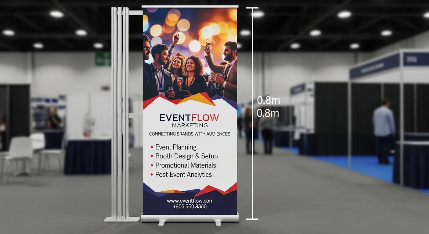
Picture your banner at a busy event. There are people standing in front of it, a table across the bottom, and bags and coats at knee height. The only part guaranteed to be seen from across the room is the top third. That is why the most important branding goes at the top, not the bottom.
The Three-Zone Layout
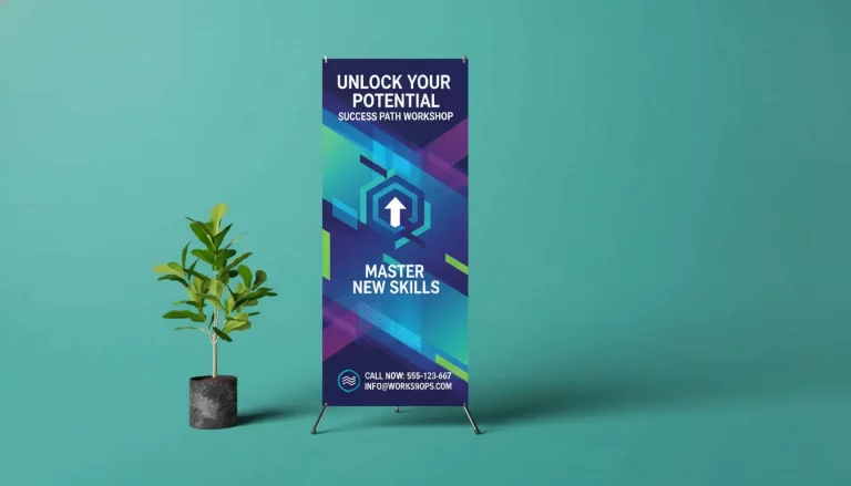
The reliable way to lay out a roller banner is to split it into three horizontal zones and give each a job:
| Zone | What Goes Here | Examples |
| Top third | Your logo and brand seen even in a crowd | Logo, brand name, strapline |
| Middle third | The main message the one thing to remember | Headline offer, key benefit, hero image |
| Bottom third | The action but keep it above knee height | Website, phone, QR code, call to action |
This is the opposite of how most people instinctively design logo at the bottom, message in the middle, contact details squeezed in wherever they fit. Flip it. Logo at the top where it survives a crowd, message in the middle at eye level, action near the bottom but never right at the base where a table will hide it.
How Much Text Should a Roller Banner Have?
As little as possible. The best roller banners carry one idea. Not one paragraph, one idea — a single headline that tells a passer-by exactly what you offer and why they should care. Everything else on the banner supports that one message or earns its place by being genuinely useful, like a contact detail or a QR code.
The One-Message Test
Here is a simple test. Stand back from your design at arm’s length, glance at it for two seconds, then look away. What do you remember? If the answer is one clear thing, the banner works. If you remember nothing, or a jumble of competing messages, it is too busy. Strip it back until one message survives the glance.
What to Cut
• Long paragraphs of body copy nobody reads on a banner
• Multiple competing offers or headlines fighting for attention
• Full service lists pick the one thing that matters most
• Dense contact blocks one phone number and one URL is plenty
A roller banner is a billboard, not a brochure. If you need to say more, use the banner to earn the conversation and let a leaflet or a website do the detail.
What Size Should the Text Be on a Roller Banner?
Text has to be readable from the distance people will actually stand. The headline needs to read from across a room, three metres or more while contact details only need to work up close. As a rule, bigger is almost always better on a banner. Here is a practical guide:
| Element | Read From | Minimum Size | Recommended |
| Headline / main message | Read from 3m+ | Minimum 100pt | 150pt or larger |
| Sub-headline | Read from 2-3m | Minimum 60pt | 80-100pt |
| Body / supporting text | Read from 1-2m | Minimum 30pt | 40-50pt |
| Contact details / URL | Read up close | Minimum 24pt | 30pt+ |
These are guidelines, not laws, but the direction is clear: err large. A headline that feels slightly too big on your screen is usually about right at full size. Always preview your design at 100% or printed to scale before you approve it; text that looks fine on a laptop can be unreadable at two metres.
Font Choice Matters Too
Use clean, bold fonts with good weight. Thin, decorative or script fonts that look elegant up close disappear at distance. Sans-serif fonts like Arial, Helvetica or a strong brand typeface read best from far away. Keep high contrast between text and background: dark text on light, or light text on dark. Low-contrast colour combinations are the second most common readability killer after small text.
How Do You Set Up Roller Banner Artwork Correctly?
Even a great design fails if the artwork is set up wrong. Two things trip people up most: the safe margins at the top and bottom, and the file setup itself.
Leave Safe Margins Top and Bottom
A roller banner does not display its full height. The bottom portion feeds into the base cassette, and the very top sits behind the pole fitting. That means anything critical placed right at the top or bottom edge can be cut off or hidden. Keep important text and your logo within a safe zone, typically, leave around 100mm clear at the bottom and a small margin at the top. Backgrounds can run to the edge, but text and logos should not.
Get the File Setup Right
Supply your artwork at the correct finished size, in CMYK colour mode, at 150dpi or higher, as a print-ready PDF. Standard UK roller banners are 850mm wide by 2000mm tall, so design to those dimensions from the start rather than scaling up a small file, which softens the image. Add a small bleed if your printer asks for it, and outline or embed your fonts so nothing shifts.
Numbered Setup Checklist
- Design at the finished size 850 x 2000mm for a standard roller banner
- Work in CMYK colour, not RGB, so printed colours match what you approve
- Keep resolution at 150dpi or higher at full size for a sharp result
- Leave a safe margin of 100 mm clear at the bottom, a little at the top
- Outline or embed all fonts, then export a print-ready PDF
The Most Common Roller Banner Design Mistakes
Most banner design problems come down to the same handful of errors. Avoid these, and you are ahead of the majority of banners at any event.
Mistake 1: Logo at the Bottom
The logo is often the most important element, and it belongs in the top third where it survives a crowd. A logo at the bottom disappears behind tables, chairs and people. Put it up top.
Mistake 2: Too Much Text
A banner crammed with text reads as a wall of grey from a distance and gets ignored. One message, big and bold, beats ten messages nobody reads.
Mistake 3: Low-Resolution Images
An image that looks fine on a website is often far too low-resolution for a two-metre banner, where it turns blocky and blurred. Always use high-resolution images supplied at full banner scale.
Mistake 4: Critical Content in the Danger Zones
Text or logos placed right at the top or bottom edge get cut off by the pole fitting or fed into the base cassette. Respect the safe margins.
FAQs
Conclusion
Banner Prints supplies roller banner stands as complete packages the printed graphic, the retractable stand and a carry case, with a free artwork check on every order and Fast & Reliable Delivery, Nationwide Across the UK. Free delivery on orders over £100.
Not confident about your design? Send it over before you print. Our team will check the resolution, text sizes, margins and colour setup and flag anything that needs fixing, so your banner works the moment it goes up no obligation.