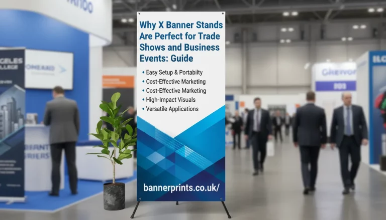
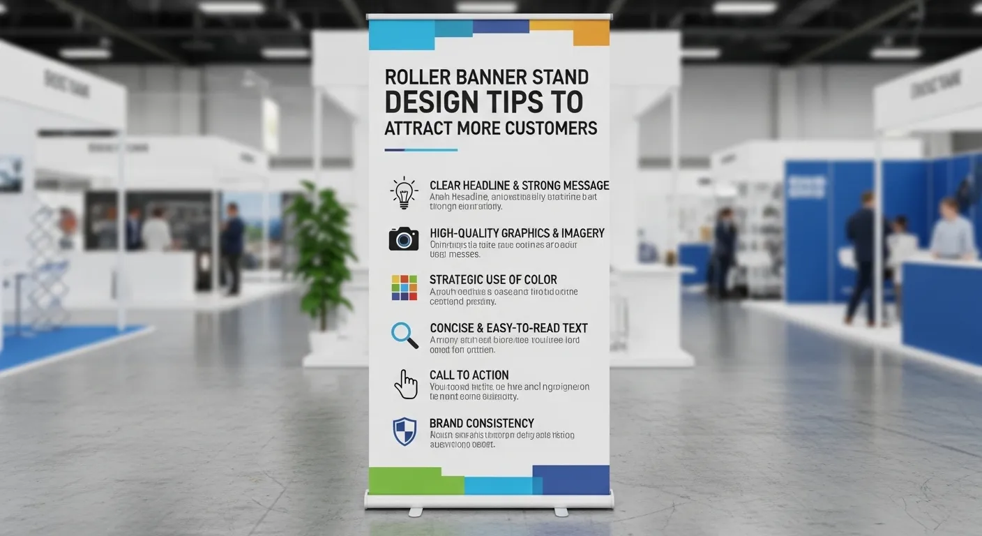
Roller Banner Stand 850mm x 2000mm Design Tips to Attract More Customers
Discover simple roller banner design tips to attract more customers. Learn layout, colours, and CTA strategies for high-impact marketing displays.
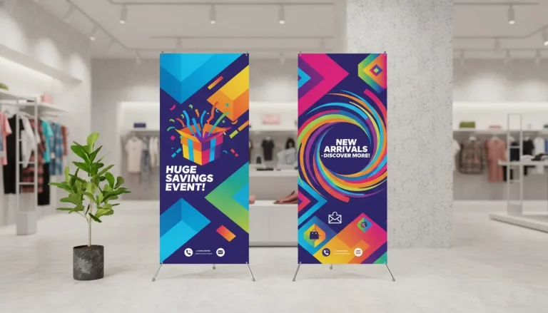
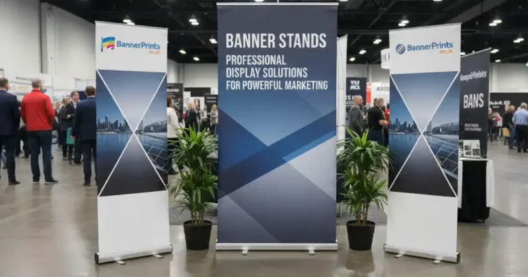
The roller banner stands are the most effective means of drawing attention in case of a trade show, exhibition, and retail space in the UK. But being equipped with a banner is not sufficient. The appearance of your Roller Banner Stand 850mm x 2000mm is one of the factors that determine whether customers will be attracted or be repelled by a crowd of people.
Most companies have difficulty in designing banners that stand out. They either overload the information, bad visuals, or are not able to convey a clear message. An effective banner needs to attract immediately, show your offer in a clear manner, and make people act. With the help of the correct design strategy, you will be able to make your banner a potent marketing media that will attract more customers and increase the interest.
Focus on Clear Visual Hierarchy
Having a good visual hierarchy would make sure that your message can be grasped in a few seconds. People do not read banners as in a brochure, they read them as they pass by. That is why you have to make sure that your most important message is at the top always.
Begin with a big bold headline, which can be seen even when one is several metres away. The key point to be offered or value should be easily conveyed by this headline. Under it, there should be a strong image or visual, which supports what you are saying. The next should be supporting details and then a clear call-to-action should be provided at the end.
This can be used as a top to bottom flow and this also aids in making the viewer follow the flow of the image naturally and this makes it easy to get your message through without complicating things.
Keep the Design Simple and Clean
Overcrowding is one of the widespread errors in banner design. The banner will be hard to read and will not have as much impact when there is too much text or too many elements added. A neat design would be much more efficient in capturing attention.
One message only and supporting text at minimal. Short phrases or information in a bullet form are easy to scan; hence, not long paragraphs. Adequate white space in the area of the elements makes them visible and enhances readability.
A plain design appears more professional and it is also easy to make the potential customers grasp what you are saying in a quicker period.
Use High-Quality and Eye-Catching Visuals
The graphics are what can be seen immediately on a banner. Strong image is capable of immediately drawing the attention and making an interest in your business. Select a high resolution picture that is the true reflection of your product, service or brand.
Do not have several pictures competing with each other. One, strong image is probably more effective. Ensure that it is a clear and sharp image to make a professional look when it is printed.
Use of good visuals plus your brand colours will enable you to have a consistent and appealing design which will be seen in crowded places.
Choose Colours That Create Contrast
The colour is significant in ensuring that you banner can be seen at a distance. High-contrast colour combinations help to make your text and visual information readable. As an example, a dark text on a light background or a light text on a dark background is good.
Use a small colour palette with the recommended number of two to three colours, preferably those which correspond to your brand image. Excessive colour combination may result in a chaotic design and loss of focus on the message.
Add Strong Branding Elements
Your business should be well displayed on your banner. This implies the use of your logo, brand colours, and the use of a similar visual style. Branding will make people know that you have a business and over time, trust will be achieved.
Position your logo in an eye-catching area and it is usually at the top or bottom of the banner. Make sure that it is big enough to be identified without obscuring the other portion of the design. Branding your entire marketing material in a standardized way gives you a professional feel and it is one of the ways your business can be noticed among the competitors.
Include a Clear Call-to-Action
There must be a banner and it should not allow people to pass by but take action. It is a definite call-to-action that instructs the viewer on the next step. It can be visiting your site, scanning a QR code, or talking to your people, but the message must be simple and straightforward.
Use plain straight forward language that generates a sense of urgency. Make the call-to-action concise and put it in a place that one can easily see, which is usually at the bottom of the banner. The high call-to-action will enhance the likelihood of transforming the interest into actual customer interaction.
Design for Distance Viewing
Your banner will find itself being seen frequently at distance particularly during exhibitions or during events with large numbers of people. This implies that your design must be legible at least three or five metres.
Headlines should be written using big fonts and should not be written in small fonts which are hard to read. Relevant details are supposed to be seen at first sight. Before printing, it is best to test your design at a distance to determine whether you have any issues with readability. Even when you design with distance in mind, your banner is not going to be useless in the real world.
Follow Proper Size and Layout Guidelines
The key aspect to designing your banner is ensuring that you do it in the proper dimensions to ensure that it will have a professional look. Its standard size ought to be 850mm x 2000mm in order to have good alignment and accuracy of printing.
Bleed margins The bleed margins help to avoid any significant content being cut off during printing. Balance and symmetry Your design elements should be aligned in a proper manner.
Test and Refine Your Design
You should also work on your design by going over it before finalising your banner. Spelling, alignment and image quality. The design can be viewed at varying distance to get an idea of how it would look at the actual environments.
The slight modifications that can be made during this phase can help otherwise. A proven design will mean that your banner will work, and get more customers.
FAQs
Conclusion
Roller Banner Stand 850mm 2000mm can be the major difference in your marketing performance. However, with an emphasis on simplicity, powerful and vivid images, and clear messages, as well as a correct layout, companies can develop banners that will capture attention and acknowledge the customers.
In exhibitions to retail advertisements, a high-impact banner can assist in enhancing the visibility and brand recognition. It takes time to do good design and be sure that your banner will produce a tangible result and help your business grow.