How to Design a High-Impact Retractable Banner

Learn how to design high-impact retractable banners for business promotion. Tips on layout, fonts, colours, and visuals to boost event marketing success.
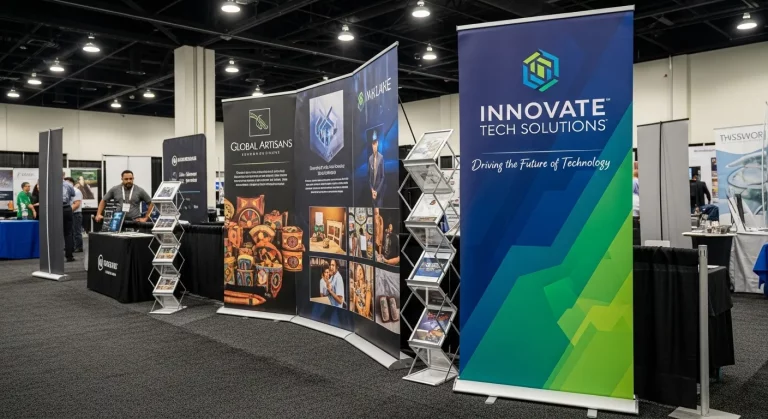
Banner Prints, to create a retractable banner that is truly remarkable at trade shows, exhibitions, and business events, it is not enough to simply add a logo and some text. In competitive business environments across the UK, companies have only a few seconds to capture attention and communicate their message effectively. A poorly designed banner can be easily ignored, whereas a well-designed banner can attract visitors, generate leads, and build strong brand recognition.
A tall pull-down banner is an effective blend of powerful graphics, concise messages and intelligent layout design. Be it the promotion of a product, service or brand, the idea is to have an easy to read display that is appealing to the eye and attuned with your marketing agenda. Through the correct design method, the mere banner can be used to make a potent promotional device.
Define Your Goal and Audience
The first thing you must know before embarking on the design process is your purpose of the banner. Do you want to make leads, sell a product or make someone familiar with a brand? Goal definition assists to create an overall design, both visual and message.
It is also important to know your target audience. Think about your attendees and what form of message will appeal to them. An example is that a company viewer can be more impressed by clean and professional design, whereas a younger viewer can be impressed by lively colours and artistic images. Having a good understanding of your audience would mean that your banner will have an impact and will result in results.
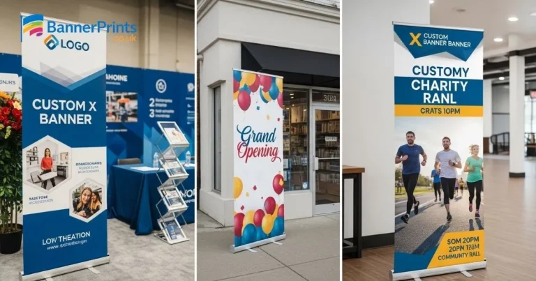
Plan a Clear Layout and Visual Hierarchy
custom X banner stands, the layout must be well structured to ensure readability and effectiveness. Anyone passing by a banner usually scans it quickly, so your design should guide the viewer’s eyes in a natural top-to-bottom direction. This is commonly known as a visual hierarchy.
Use your logo on the top to create brand name. Keep your main headline at the centre so that it is at the centre and most visible. The information that supports it should be presented then and a clear call-to-action should be included close to the bottom. Then do not clutter the design with excessive information. White space assists in making the banner easier to read and makes the banner itself look clean.
By using a plain and structured design you will make sure that despite not being close by, your message can be perceived.
Use Bold Fonts and Readable Text
Text is also a major consideration in the design of banners but it should be readable at a number of metres. Use fonts that are bold and clear that will be visible in crowded places. Sometimes the best fonts to use are sans-serif fonts as they are modern and clean.
Headlines must be big enough to attract immediate attention and supporting text must not be too many but should be visible enough to be read. One should also not use a lot of various fonts as it may clutter the design. Typography allows one to be consistent to appear professional.
The trick is that you should make your message simple and straight to the point that the viewers will grasp the message you are conveying in a few seconds.
Choose Colours That Match Your Brand
The choice of colour plays an important role in designing an attractive banner. It must be designed to portray your brand identity in addition to being superior in a saturated environment. Consistency and recognition: It is better to use two or three major colours of your brand palette.
The significance of contrast is readability. An illustration here is light text on a dark background or dark text on a light background which makes them easier to see. Do not use excessive colours as that will distract the message that you are trying to convey.
Proper selection of colours is not only a good way to beautify the design but also to connect better with the audience in the emotional aspect.
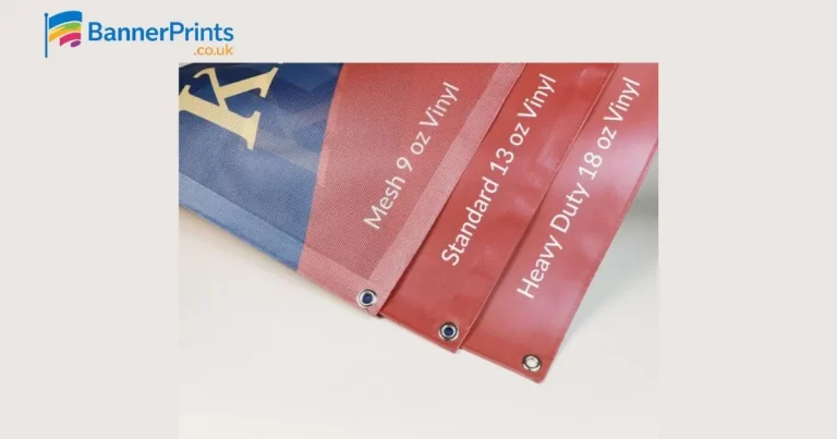
Use High-Quality Images and Graphics
Graphs and pictures are significant in getting attention. One good picture could be a lot more effective than a number of smaller pictures. Select images that are applicable to your message and are on your brand.
Make sure all pictures are high-resolution so that they are not pixelated. You may have blurry or low quality images which may diminish the overall effect of your banner. You should not drown your message with graphics.
The powerful visual component allows forming preliminary impressions and makes people want to communicate with your presentation.
Create a Strong Call-to-Action
A retractable banner must at any rate lead the viewers into a particular action. A clear call-to-action (CTA) will be of significance in this case. The CTA can be a one-syllable word, a visit to a site, or even a conversation with your workgroup: it needs to be straightforward and straightforward.
The call-to-action should be kept close to the bottom of the banner in a place that can easily be observed. Employ action oriented language which stimulates instant action. Do not use several CTAs because it may be confusing.
An effective CTA boosts the interactions and contributes to the transformation of interest into concrete business prospects.
Keep the Design Simple and Focused
Avoiding excess in terms of information is one of the worst errors to make in banner design. A messy banner may intimidate the audience and decrease its efficiency. The most important aspect of coming up with a high-impact retractable banner is simplicity.
Keep one message and enable it with reduced text and powerful graphics. There should be no superfluous information that is not relevant to the whole design. An uncluttered and minimal design is certain to make your banner easy to read and look at.
Note: your banner is not supposed to tell it all, it is supposed to create attention and initiate discussions.
Prepare Your Design for Printing
It is worth checking all the arrangements before submission of your design to be printed. Take the right dimensions like 850mm x 2000mm and incorporate bleed margins to eliminate cutting problems. Make sure the pictures are of high quality and the colours are properly configured.
Test your design in the real world to observe what it will look like in reality. This assists in determining any problems in readability or layout. These changes at this point make sure that the final printed banner is professional and effective.
Quality printing is also very important in the end product. Reliable services, like https://bannerprints.co.uk/ should be used.
gives you a sharp detailed design in vibrant colours.
FAQs: Design High-Impact Retractable Banners
Final Thoughts
A high-impact retractable banner design would take a balancing approach of both creativity and strategy. Businesses can make banners that shine in the crowd in the busy events setting by concentrating on clear messages, images that are eye-catching and an effective layout. Each component such as fonts and colours to images and call-to-action contribute towards a successful design.
An eye-catching banner is one that does not only get attention but also enhances brand presence and makes people act. No matter the type of event such as a trade show, exhibition or even a promotional activity, you will gain a lot by investing time in designing a good banner that will greatly enhance your marketing.