Common Roll Up Banner Design Mistakes to Avoid UK : Guide
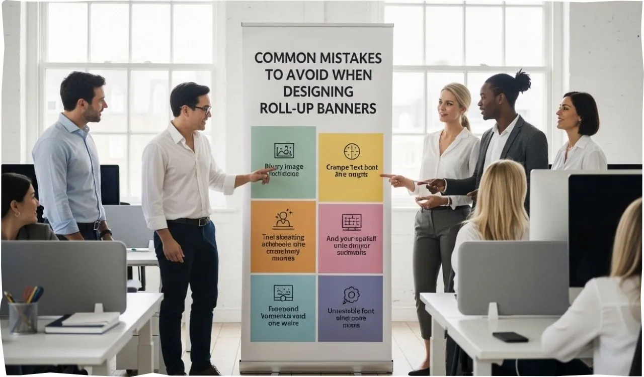
Avoid costly roll up banner design mistakes. Learn key errors to fix, improve visibility, and create banners that attract more customers at UK events.
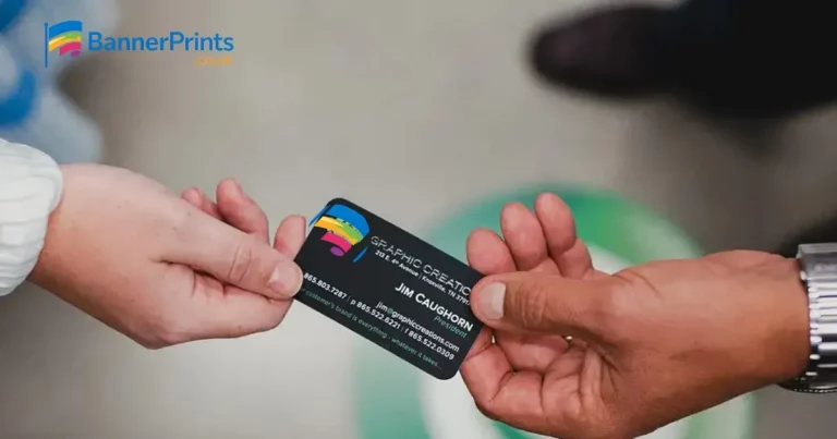
Banner Prints,, roll up banners are among the most efficient promotional tools for trade shows, exhibitions, as well as retail promotions in the UK. They are lightweight, affordable, and can create a strong visual impact when designed properly. However, many businesses fail to achieve optimal results due to common design mistakes that reduce visibility and limit customer engagement.
A badly made banner may escape the attention, even under high traffic settings. Conversely, a strategically designed roll up banner will capture the eye, relay your message effectively as well as lead. It is also vital that one knows what not to add to but what to exclude. We will discuss the most frequent errors in roll up banners design and the ways to correct it to achieve the best outcomes in this guide.
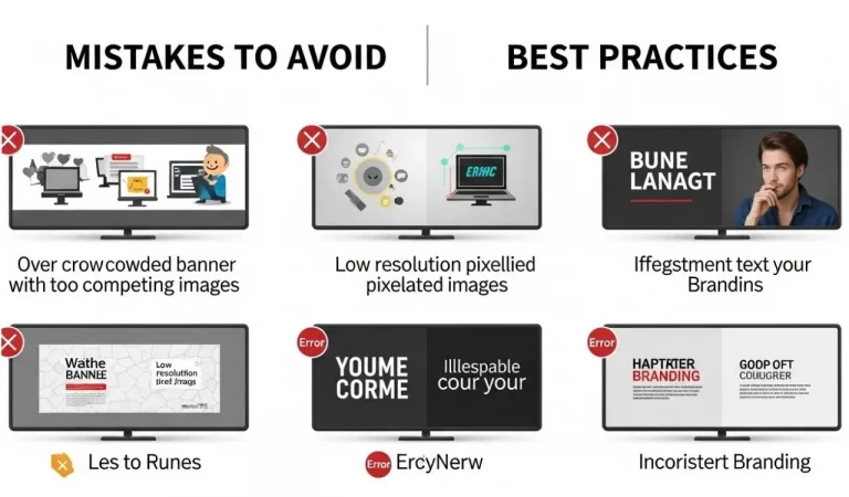
Overcrowding the Banner with Too Much Content
It is one of the largest flaws in banner design that attempts to add too much information. Companies would want to insert long paragraphs, numerous pictures, and too many facts on the belief that it would be more valuable. As a matter of fact, this bombards the viewers and renders the banner unreadable.
Banners are normally viewed between 2 and 3 metres. They will not have time to read your content in case it is too dense. Rather, you should have one main message and some few important points. Your message can be easily noticed because of a clean design with a minimum of text.
It is better to be read in short phrases, bullet points, and a powerful headline that will allow the viewer to remain engaged.
Using Low-Quality Images
custom X banner stands , the quality of the image is very important in giving the banner a professional appearance. Low-resolution or stretched images can appear blurred and pixelated when printed in large formats. This not only reduces visual appeal but can also damage your brand image.
Always ensure that the images are of high resolution and preferably with a 300 DPI, so that they become clear. Another good alternative is to use the vector graphics because it does not deteriorate with size. When printing, make sure that all the visuals are correctly sized to the size of the banners.
The high quality and sharp image of the image immediately enhances the overall effectiveness of your design and makes your banner more appealing.
Ignoring Brand Consistency
Trust and recognition are only possible through brand consistency. Most banners fail to follow the same font style, consistent colour scheme and placement of logos. This generates a disconnect and deteriorates brand identity.
At all times your banner must indicate your business branding. Keep it professional with your official colours, logo and typography. You can use two or three colours that will form the core of your colour palette to ensure the design is clean and focussed.
Branding is important as it will make your audience remember your business name, even when it is surrounded by numerous other businesses in a convention setting.
Weak or Missing Call-to-Action
A roll up banner that does not have a clear call-to-action (CTA) is an untapped opportunity. Most of the businesses contain information and do not provide instructions to the viewer as to what to next do. Lacking guidance, potential customers can just stroll away.
Your CTA must be straight forward, simple and action-oriented. No matter whether you visit the web-page, scan the QR code, or talk to your colleagues, the message must be comprehensible. The CTA should be displayed somewhere visible and normally at the bottom of the banner.
And a good CTA will do the trick but get action and make your banner more effective.
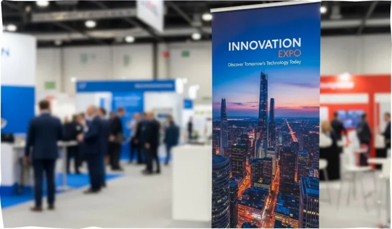
Not Considering Viewing Distance
It is a mistake to design a banner and not think about the way the banner will be seen when it is distant. Compared to several feet in the distance, small fonts, elaborate graphics, and cluttered layouts are hard to read.
At least three to five metres readable distance of your banner. Headlines should be written in large fonts and supportive text should be minimal. Visual representation must be clear and bright and should be seen even where there is a lot of traffic.
Test printing your design over distance before printing can be useful in understanding that there is a problem with readability and enhancing the final product.
Poor Colour Choices and Lack of Contrast
Colour significantly contributes to attention drawing, and bad colour usage may decrease the readability. Excessive use of colours or combinations that are not high contrast in design results in a confusing and slow to read design.
Use few colour palette which is in line with your brand. Effective use of contrast, e.g. light text on a dark background or vice versa, to enhance readability. Do not mix colours that can make text difficult to read.
An equalised colour scheme makes the appeal more attractive and message more readable.
Lack of Clear Visual Hierarchy
The way in which the banner is arranged in terms of information is known as visual hierarchy. In the absence of an obvious structure, the viewer might not be able to grasp the message in a short time. This usually occurs in cases where equal emphasis is provided to everything.
The design must lead the eye of the viewer up and down. Having your logo at the top then a powerful headline, supporting text and call-to-action at the bottom is a good way to start. Highlight the most important information by use of size, spacing and positioning.
Strict hierarchy will give the impression that your message will reach the whole world in seconds.
Incorrect Size and Print Setup
This may give inappropriate results even with the use of incorrect dimensions or neglect of the print requirements. When the design you designed is not in accordance with the right size of a banner, essential things will be trimmed away during printing.
Always draw at the right dimension, e.g. 850mm x 2000mm and with bleed where it is required. This will make sure that your design is going to print out and all the information will be saved.
Professional printing with such services as https://bannerprints.co.uk/
helps provide the proper sizing and quality production.
Poor Placement at Events
A well-designed banner can also fail even when it is not put in the right position. Placing the banner in sparsely frequented places or places that will cause obstruction will lower the visibility and effectiveness.
Your banner should be situated in a place that people can see easily like at entrances or walk ways or in your exhibition stand. Make sure that it is on eye level and not covered with furniture and other exhibits.
Place will give maximum exposure and higher possibilities of attracting attention.
Skipping Final Design Checks
Most of the businesses are hurried in designing and do not complete final checks before printing. This may lead to spelling mistakes, composition and quality of image.
Proofread your design before printing. Check text to error and make sure the images are high resolution and layout to check. The design can also be viewed at a distance to find out whether it has any readability issues.
When you have some time, do some final checks so that your banner would appear professional and work properly.
FAQs: Roll Up Banner Design Mistakes to Avoid UK
Final Thoughts
To create a successful roll up banner a lot of planning and attention is needed. It is possible to avoid the major pitfalls like too much content, inadequate image quality, ineffective call-to-action, and lacking consistent branding to achieve much better outcomes.
A properly designed banner must be easy to read, attractive to the eyes, and readable even when one is far away. With clarity, good images and good layout, companies are able to make banners that are eye catching and provide actual marketing value.
To print high-quality and achieve good outcomes, it is better to resort to professional printing services such as that of https://bannerprints.co.uk/.
steps up your banner to industry expectations and makes your business get noticed at all times.